Installments forms reimagined:

UI and UX changes that engage users.

Introduction

In today’s digital age, user interaction is no longer a luxury, it is a necessity. Whether someone is purchasing a product, subscribing to a service, or signing up for a newsletter, the way they interact with the forms on the website can make or break their experience. User interaction is the cornerstone of effective design. When users feel guided, supported, and understood by the design, they are more likely to complete the desired action—especially with something as complex as installment application forms. Forms are often perceived as barriers to a user’s goal, and it’s up to designers to transform this necessary step into an intuitive and positive experience. The smoother the interaction, the more likely users are to complete their purchases, payments, or subscriptions. Good UI and UX help remove the friction that could otherwise cause users to abandon the process. 

UI vs. UX: Understanding the Difference in Installment Application Forms

While UI and UX are closely related, they focus on different aspects of design, and both are essential for a form’s effectiveness: 


UI (User Interface): UI is about the visual components of the form—buttons, text fields, dropdowns menus, colors, typography, and alignment. In the context of an installment application form, UI determines how visually appealing and cohesive the form looks. For example, having well-designed buttons and clearly defined fields improves the ease of navigation for users.  


UX (User Experience): UX is the overall feeling and functionality of the form. It’s about how easy and intuitive it is for a user to complete their task. In an installment application form, UX is all about guiding the user through the payment process smoothly, from filling in their details to understanding each step of their commitment. Good UX makes the user feel comfortable and confident in their actions, reducing frustration and increasing the likelihood of completion. 

The Role of UI and UX in Our Installment Application Forms

The UI and UX of installment application forms are crucial, as these forms often require users to make a financial commitment, which can feel complicated. A well-thought-out form reassures users, making them feel at ease. Here’s how: 


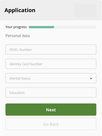
Navigation: Through thoughtful UX design, users are presented with a clear path through the form. For example, breaking the form into digestible sections made it less overwhelming. Forms organized in a logical order help users to complete it more quickly and with less effort. UI elements like progress indicators also play a role here, showing users how much of the process remains. 


Consistency and Simplicity in UI: Maintaining consistent colors, typography, and button styles creates a seamless experience. Consistency builds trust, as users recognize a familiar visual style as they move through each form step. 


Feedback and Error Prevention: Both UI and UX should include real-time feedback, such as showing a checkmark when fields are correctly filled or displaying a red highlight for incomplete or incorrect entries. This reduces user frustration and helps them complete the form accurately. 


Accessibility: A crucial UX consideration is ensuring the form is accessible to all users. This means including screen-reader compatibility, visible labels, and large enough buttons for easy clicking. Ensuring inclusivity allows all users to feel valued and understood. 


To stay competitive, we integrated the latest trends and best practices in UI and UX: 


Minimalism and Clarity: Overly complex designs can overwhelm users. We believe embracing minimalism by focusing on only the essential fields and details significantly enhances usability. Visually appealing designs create more enjoyable experience which reinforces satisfaction and loyalty.


Mobile-First Design: With mobile usage on the rise, designing forms optimized for smaller screens is essential. This involves larger buttons, simplified navigation, and a single-column layout for easy scrolling.


Personalization: We adapted forms to user input, showing or hiding fields as relevant. Personalization in UX makes forms feel tailor-made, avoiding information overload and making users feel understood. 


Instant Field Validation: Rather than waiting until form submission to show errors, instant validation allows users to correct mistakes as they go. This UI feature supports better UX by preventing frustration at the end of the form. 


In today’s competitive market, a well-designed installment application form with carefully balanced UI and UX increases conversions, boosts brand credibility, and leads to greater customer satisfaction. User interaction isn’t just about getting people to click through a form; it’s about making sure they feel confident and supported throughout the process. By adopting current trends like minimalism, mobile-first design, and instant field validation, businesses can stay ahead of the curve and create forms that delight users at every step. In the end, when UI and UX come together seamlessly, users have a frictionless and positive experience—one that makes them more likely to return and recommend. 

Major UI and UX changes

The most important criterion for font selection is the appropriate readability of the text on the page. A font with the right size, style and spacing between characters makes text easier to read, which is especially important for mobile devices. As part of the UI changes, we changed the font on the credit application form pages. The selected one, along with the appropriate style of headings, field labels, buttons and main text, facilitates content scanning and navigation, making our interfaces easier to use. 


One of the key UI changes was modifying the color palette to one based on natural colors (white, black, gray and soft tones). We use accent colors sparingly, only on buttons or important elements. This helps to highlight key elements and draw attention, so users know which elements are most important. The colors used on the credit application form pages provide adequate contrast between text and background, which consequently increases readability and reduces eye fatigue, especially when using the interface for long periods of time. Chosen font along with colors contribute to the overall aesthetics and provide a consistent experience.  


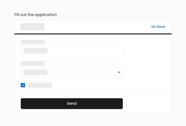
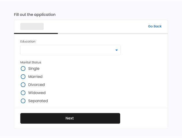
We have changed the design of the buttons to provide a clear way for users to take actions, such as navigating to another page or submitting the form. Buttons used on credit application form pages ensure visual hierarchy which highlights the most important action user can take. The design of input fields, dropdowns, radio buttons and checkboxes has also been changed to make it as easy as possible to enter the required data.  

Form after

The footer has also been redesigned. We replaced the text and links with clickable buttons, whose labels clearly communicate what information the user will find out after clicking on them, thus enabling a much simpler and faster familiarization with the content of the page.  

Form after

Limited color palette, small number of font styles and sizes with simple shapes, the lack of additional visual effects (graphics, shadows, gradients) or the use of simple single-color icons make the design of credit application form pages minimalistic. Our goal is to keep visual elements to an absolute minimum to focus the user’s attention on the content and function of the interface. Space is intentionally left empty to improve readability and aesthetics. The screens look modern and refreshing, which can increase user engagement. 

Form after

Credit application forms require users to provide a very large amount of data and for this reason they can be very long, involving users’ time resources. This poses a considerable challenge, as often users are not ready to answer so many questions, especially if they apply for financing for low value purchases.  


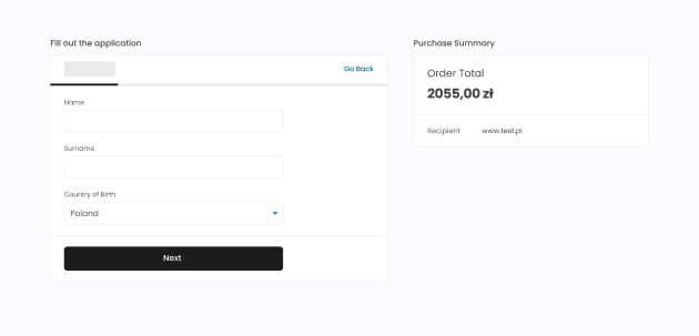
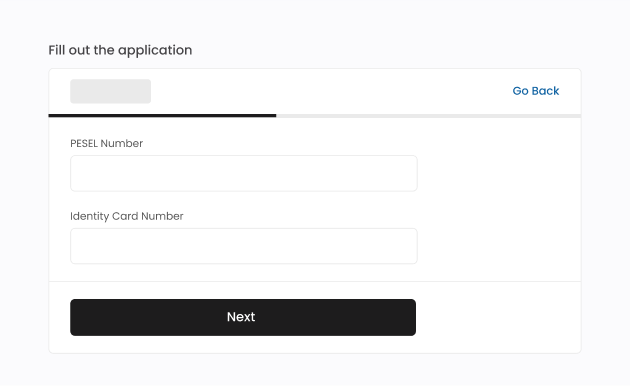
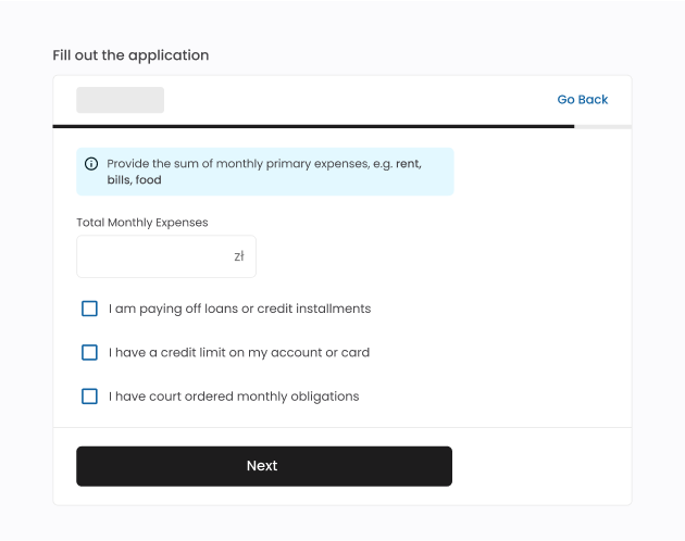
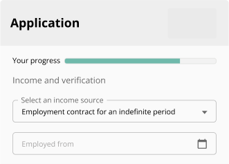
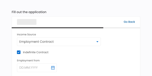
One of the biggest UX changes was the modification of the credit application form flow. Our goal was to make the form more conversational to set the tone for human-like interaction. The form was divided into more, shorter sections, in which fields are compatible with each other in terms of content. Changes involved looking at each individual field on the form, to assess whether it is possible to remove or modify it. We present to the user only the fields required for the process. If it is necessary to clarify the content, relevant questions appear when the user selects the right option. This solution does not lead to information overload and allows to go through the steps of the form faster and easier. 


Before:

Form before

After: 

Form after
Form after

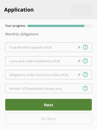
The progress bar visible on the form screen makes the process more predictable for the users and increases their sense of control while filling out the application. Progress bar motivates to complete the form: the closer you get to the end, the greater the determination not to abort the task.  

Form after

We reduced the length of messages delivered to the user. We use concise, short and precise field labels. It allows faster form scanning, more efficient processing of the page content and helps users to provide the most accurate information. Precise wording of labels enables to remove tooltips, which require additional interaction (clicking or hovering the mouse). It is not always certain that the user will read tooltip’s content. If a particular field on the form needs to be clarified then the information is placed above or below the field in a dedicated box, always visible to the user.


Before:

Form before

After:

Form after

Any messages placed on the screens are created with UX writing best practices in mind. The content presented is short and easy to understand. The forms indicating the gender of users are not used and technical jargon is avoided. Through such measures, we address the forms to a wider audience. 


Before:

Form before

After:

Form after

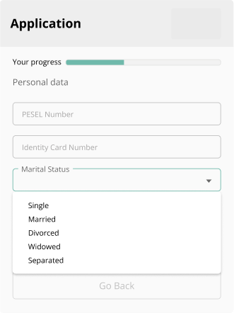
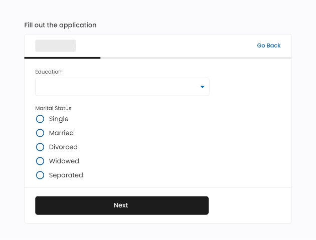
We use radio buttons or checkboxes, instead of using dropdown lists if the number of available options is not more than 7 (±2), according to Miller’s Law. Dropdown lists require the user to perform an action to learn about all available options. If the list is long, scrolling action is additionally required. Radio buttons and checkboxes allow users to review the available options as soon as they appear on the screen.


Before:

Form before

After:

Form after

Changes made on credit application form pages were designed with Web Content Accessibility Guidelines in mind. Following this set of guidelines ensures that websites or mobile applications are accessible to users and no person feels excluded. For example, we selected the new color palette considering the appropriate contrast between the background and the text color. Interactive form elements can be accessed from the keyboard, which is especially important for people who are not able to use a mouse or touchpad. We also used solutions that allow people using screen readers to explore the site. Complying with WCAG ensures that every user can benefit from using credit application forms.   


After implementing UI/UX changes, we observe an increase in conversion rates depending on the credit application form up to 4pp.

Challenges when designing a form

Designing an installment application form that builds user trust and communicates data security involves a mix of visual, informational, and interaction cues that reassure users their information is safe. This reassurance comes from both the direct communication of security measures and the subtle aspects of design that convey transparency, professionalism, and reliability. Here’s how an effective form can achieve this:


Clear Data Usage Explanation: we state why pieces of information are necessary to show that data is not being collected without purpose.


Privacy Policy Links and Summaries: we explain key points of the privacy policy in the consent section, users have easy access to the full policy if they want more details.


Avoid Hidden Data Requests: we clearly outline all the information required. This solution emphasizes transparency.


Editable Consent Choices: we provided options for data consent, with checkboxes to consent to data usage and headlines summarizing the content of the consent. This gives users a sense of control and encourages them to feel they are actively participating in their data privacy.


Mobile and Desktop Consistency: we provide a seamless, consistent design across devices which reassures users that the form is reliable. 


Maintaining consistency in installment application form experiences across various providers is a real challenge, as there are differences in data collection per provider.  


A standardized, adaptable design approach, a uniform layout structure, and consistent terminology are the key steps in our installments’ application forms. Building such standards provides users a smoother experience and allows businesses to maintain a seamless, reliable feel across all installment options, reinforcing trust at every step.

Summary

A well-designed installment application form plays a crucial role in enhancing user experience, simplifying complex processes, and increasing conversion rates. UI changes improve the visual and interactive elements of a product, like colors, fonts, and button styles. UX changes focus on the overall experience and functionality, ensuring the product is easy and satisfying to use. A well-designed form is consistent and simple, includes appropriate navigation, incorporates feedback, prevents errors and ensures accessibility. Our forms take into account the latest trends and best practices in UI and UX.


Recent changes in installment application forms focus on streamlining the user journey by implementing clear, intuitive steps, reducing cognitive load, and minimizing the information required upfront. Changes in font, typography, color palette, buttons and footer were some of the major changes in the UI. UI improvements emphasize visual clarity—such as grouping related fields and adapting layout for mobile devices. These changes reduce user frustration and errors by breaking down information and minimizing distractions. UX changes included the modification of the credit application form flow. Input field labels have been changed to be shorter, more precise and concise and the messages have been tailored to incorporate the best practices of UX writing. Key UX changes also include progress indicators, allowing users to understand their position within the form, and personalized steps to guide them more effectively.


The most accessible solutions have been implemented for the user to make a choice among the available options (e.g. radio buttons, checkboxes). UI/UX changes were designed with Web Content Accessibility Guidelines in mind, including the ability to navigate with the keyboard and the use of a screen reader. The design of these forms focuses on building, maintaining trust and communicating data security. Overall, these UI/UX changes help build trust and ease for users, encouraging them to complete the installment process while feeling supported and in control. 


Take a moment to revisit your own pages and see them from a fresh perspective—are they visually appealing and easy to navigate? Consider whether your design choices make interactions simple and satisfying for users. Even small improvements to both UI and UX can make a big difference, enhancing both the look and the usability of your form. 

1